Beautify Font style #147
Comments
|
Hello @Geetanjali2001, thank you for raising an issue. Please ensure that it is detailed and clear along with an acceptance criteria. |
|
What kind of beautification you wanna do?
What's it you gonna do? |
|
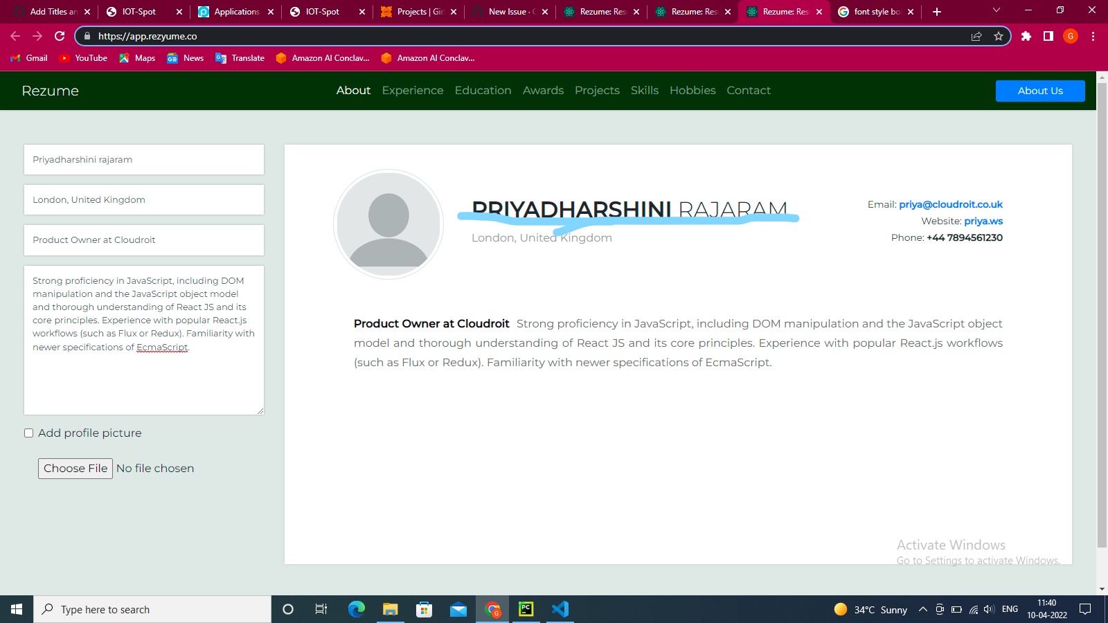
As in the name 'PRIYADHARSHINI Rajaram' first name is bold and last name is not bold so it's looks so weird. I want to change font style of Rajaram by making it bold. |
@Geetanjali2001 To give you an idea of what went into the discussion, we had several iterations... We started with this design first:
The CV was not at all attractive, and a lot of people are sending out ill comments about the basic look at feel without any emphasis or strongness on the name. So here's our second iteration, where we gave some emphasis on the name:
People were feeling the font was 💩 and they didn't like the overall presentation. So we started concentrating on the fonts and kept trying out different ones with professional stuff. We came up to our third iteration:
Montserrat was liked by a lot of folks, and it's my official website's font as well. But something was off-screen. The heading was given too much importance so we decided that's beating the font style out. So here's our fourth iteration:
Making use of the font's lighter tones made it look really good and a lot of folks liked it. We had issues with two things. One, it's conventional, that the name should be bolder, and second, when it gets mixed up with western folks and our local folks, they don't know which name should they call. To combat this, we came up with the idea of giving importance to the given name with not compromising on the complete full name. So here's our final and current iteration:
I would be very very happy to know your thoughts from this, @Geetanjali2001, and the thought process that went in through the whole journey, and if you have some comments, I am happy to hear them now. 😊 |


|
Ok |
|
@Geetanjali2001 Anything? |
|
No |
What happened?
Hi,
I want to beautify the font style
.
How can we reproduce this bug?
I will change the font style in the last name of the person as first name is bold and last name is not bold.
Desktop Information (Optional)
No response
Urgency (Optional)
No response
The text was updated successfully, but these errors were encountered: