UX Issues in DOCS page of github rest api #40691
-
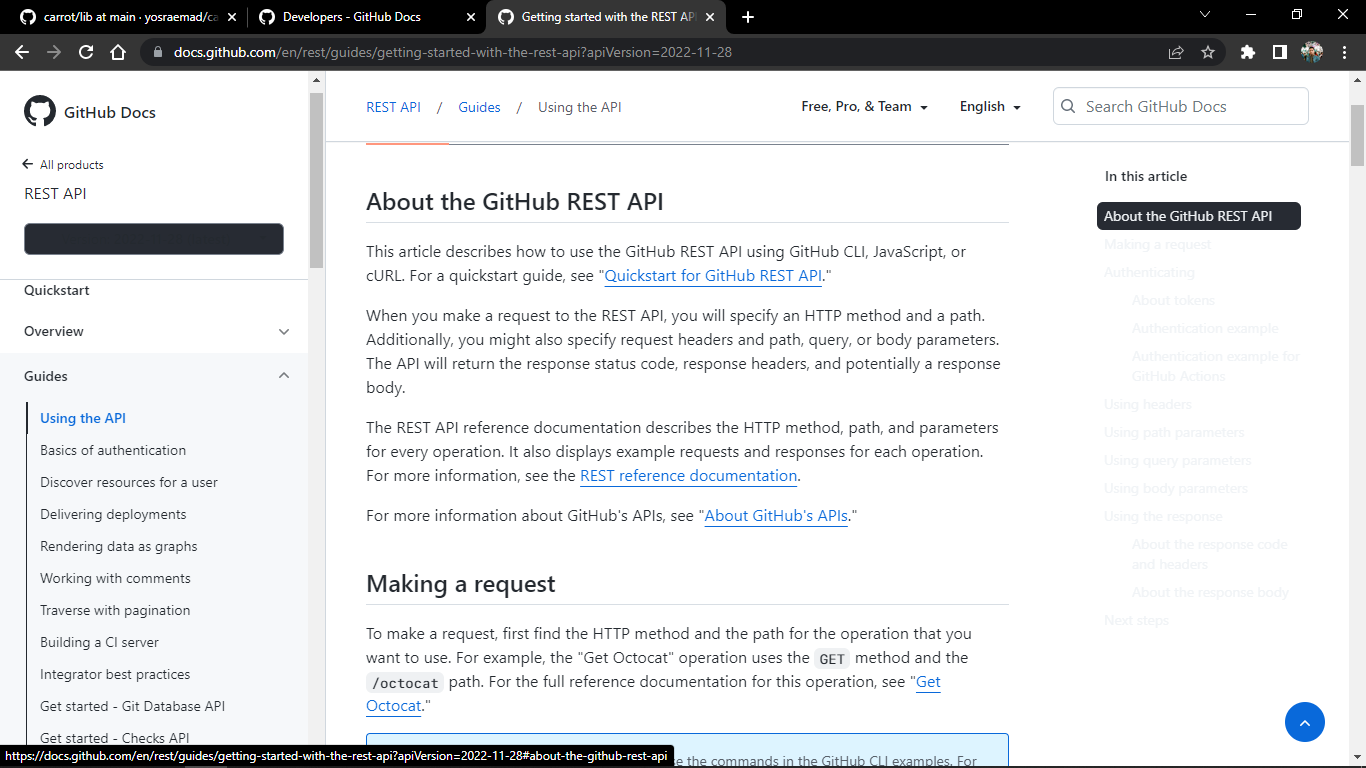
Select Topic AreaBug Bodyi headed on to the github rest api docs page to get an overview of the api, i noticed some user experience issue in the UI. ➡ version dropdown has contrast issues, the text is visible only when hovered on please fix these usability issues! |

Beta Was this translation helpful? Give feedback.
Replies: 2 comments
-
|
Hi there @rehan-ankalgi-7t2 and welcome to our community! Thank you for reporting this! |
Beta Was this translation helpful? Give feedback.
-
|
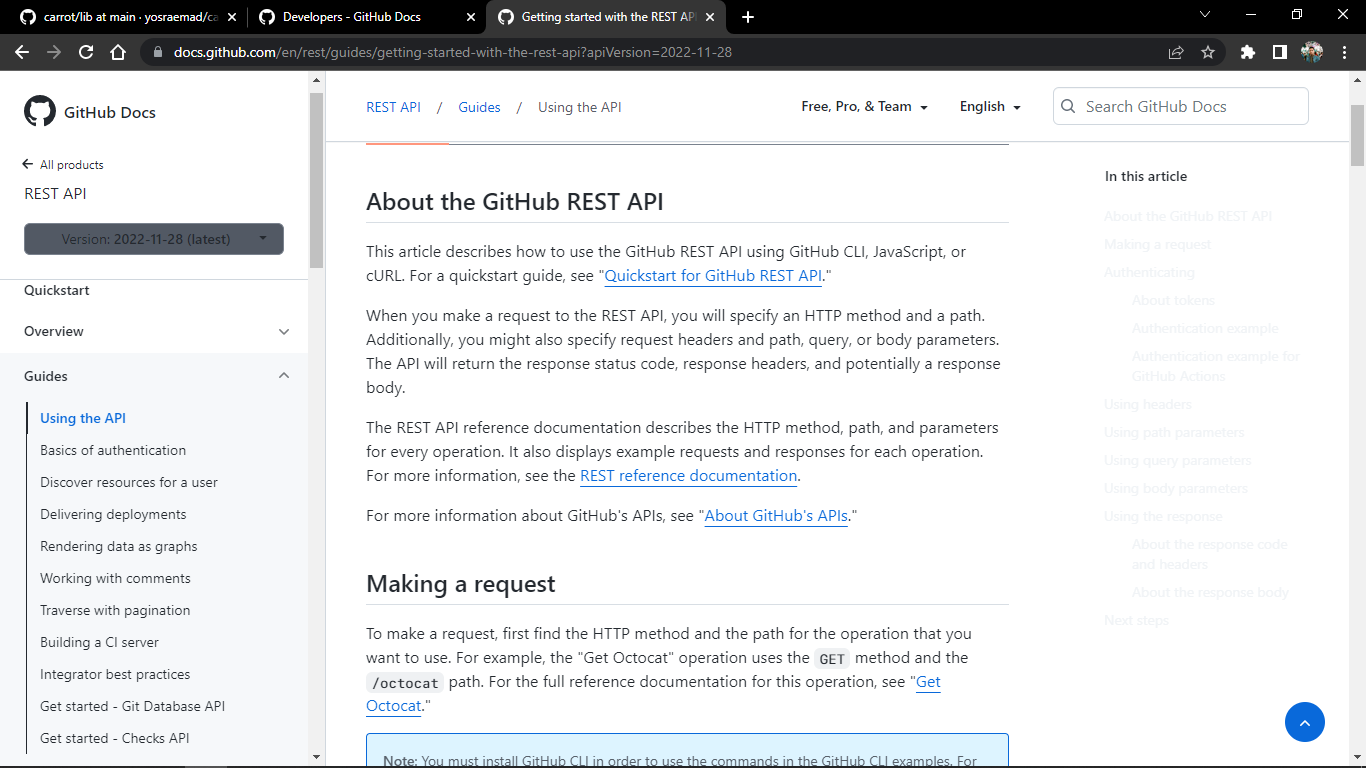
Hey @rehan-ankalgi-7t2, I appreciate you reaching out about this issue. I checked out the same page on my end and I'm not quite seeing the same thing. Here's a screenshot of what I'm seeing on my end: Are you still seeing those contrast issues on your end? If so, can you try viewing the page again Incognito Mode (or your browser's equivalent of that) and see if that changes anything for you? If the issue is resolved in Incognito Mode, clearing your browser's cache and cookies should ultimately do the trick. |
Beta Was this translation helpful? Give feedback.
Hi there @rehan-ankalgi-7t2 and welcome to our community! Thank you for reporting this!