Displaying batteries in a grid #605
Comments
|
TBH standard Lovelace cards have a fixed width (per screen width) and forcing them to be wider won't looks nice. I think that when you will have some other cards at the same dashboard you will see misalignment which will be hard to solve. Another tricky thing would be to handle mobile screens. Do you have any other cards which do something similar? In general I think that when you have a lot of battery devices/entities it is better to use groups (which will hide the batteries with higher levels and show the ones which require your attention). I'm not rejecting the idea but I'd like to know what is the exact expectation (example screenshots would be the best) |
|
Hi,
Thanks for quick reply. I do understand this is mostly a cosmetic thing.
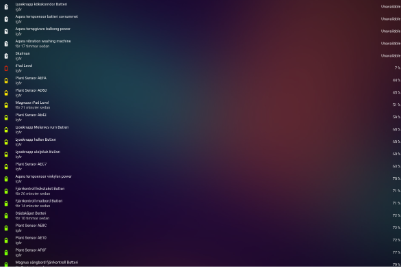
My main problem is it looks like this on my wallmounted ipad dashboard; the list is very long and don’t use the horizontal space. It makes more sense in my design a system monitor page with wider widgets that are not e.g. 100 items long, as the scrolling effort looses navigation context I think.
Perhaps I just do a column for each group as you say - I might have column 1 for 0-25%, column 2 for 25-50% battery etc. Conceptually it isn’t really the same thing – a long list sorted by battery% with column-wrap, but lists with hard coded range intervals - but it would work. Only thing is all columns would get different length but that is just cosmetic.
My original thought was something like this (pls ignore the background color as it is a result of cut & paste making a mockup) – but I think perhaps I just go with groups:

Från: Max Chodorowski ***@***.***>
Datum: söndag, 26 november 2023 17:43
Till: maxwroc/battery-state-card ***@***.***>
Kopia: Magnus Unemyr ***@***.***>, Author ***@***.***>
Ämne: Re: [maxwroc/battery-state-card] Add support for columns of data (Issue #605)
TBH standard Lovelace cards have a fixed width (per screen width) and forcing them to be wider won't looks nice. I think that when you will have some other cards at the same dashboard you will see misalignment which will be hard to solve. Another tricky thing would be to handle mobile screens.
Do you have any other cards which do something similar?
In general I think that when you have a lot of battery devices/entities it is better to use groups (which will hide the batteries with higher levels and show the ones which require your attention).
I'm not rejecting the idea but I'd like to know what is the exact expectation (example screenshots would be the best)
—
Reply to this email directly, view it on GitHub<#605 (comment)>, or unsubscribe<https://github.com/notifications/unsubscribe-auth/AMCAUXLF2A4JZN7OG6UX6ZDYGNWTTAVCNFSM6AAAAAA7Y3ITB6VHI2DSMVQWIX3LMV43OSLTON2WKQ3PNVWWK3TUHMYTQMRWHAZTCOBYHE>.
You are receiving this because you authored the thread.Message ID: ***@***.***>
|
|
Ok now I get what you mean... I have played with CSS little bit and it looks like it is achievable although the order is not column-wise but row-wise otherwise we would need to have a fixed number of items in column (I think) This is the result The CSS I've added is the following .card-content {
display: flex;
flex-wrap: wrap;
gap: 30px;
}
.entity-spacing {
margin: 0;
width: 300px;
flex: 1 1 auto;
border-radius: 6px;
background-color: rgba(0,0,0,.1);
padding: 5px 10px;
}TBH the above CSS code wont give you much now. But I'm planning to bring back the If you want to can experiment now with card-mod card which allows to apply custom styles to the other cards (and use the above css code, although some basic knowledge about CSS would need to be needed as this CSS is not complete and probably some adjustments would be needed) |

|
Hmm maybe it make sense to add these styles by default and enable them on some config option/switch. I'll think about it |
|
This is great progress, and I am fine with the battery-level sorting being row wise and not column wise, if that is far easier to implement. |
I have many battery driven devices and the card has full screen width; it would be nice if the list of battery status can wrap over to more columns automatically; so I get all entities sorted by batter without having to create several cards with different filtering conditions (like column 1 for 0-25%, column 2 for 25-50% etc). Being able to have one long list of entities just wrapping over to a new column would be great.
The text was updated successfully, but these errors were encountered: