Now that we have our styling in order, let's think about how to build larger web pages in an orderly way...
<div id="greeting" class="section">
  <h1>Hello!</h1>
  <p>This content is all related!</p>
  <p>Nice that we can group it using a "div" tag!</p>
</div>
The <div> element is a generic block element which defines a section of your page. Unlike block elements with specific meaning and implied default styling (like <h1> and <p> tags), <div> elements don't change the appearance of the page until styles are applied to them.
<p>Sometimes, <span class="highlight">all we really want</span> is
to be able to refer to certain sections of our page, but we want to completely
<span class="highlight">control their styling</span>, and not get the
"b" or "i" tags involved</p>
The <span> element is a generic inline element which defines a section of your page. Unlike inline elements with specific meaning and implied default styling (like <b> and <i> tags), <span> elements don't change the appearance of the page until styles are applied to them.
Let's add another page to our growing Portfolio Project! This page will be for your future personal blog.
-
Repeat the same steps we went through to build the
projectsandmediapages. We'll call the blog pageblog(makes sense, right?). Once you've finished creating the blog page, your site's directory structure should look this:/ (root) | |-/blog | |-index.html | |-/media | |-index.html | |-/projects | |-index.html | |-index.html |-.git (hidden directory) -
Inside of your new
blog/index.htmlfile, create a short blog post welcoming readers to your blog (no more than 5 sentences of content). More important than the content will be the page structure and layout. Make sure to include the following elements in your post as separate<div>s:- A header area (with your blog title/subtitle, and maybe a splash photo)
- A nav bar area (with links to other pages in your Portfolio site)
- A content area for the text content of your post.
- A footer with some contact info and copyright information.
-
Inside the content area, make sure that you've used at least one of each of the following:
- A heading (e.g.
<h2>) - A paragraph tag (
<p>)
- A heading (e.g.
-
In a
<style>tag in the head of the document, add some style for default HTML elements (<body>,<div>,<h1>,<h2>,<p>, and whatever else you've included in your HTML up to this point). -
Give each
<div>section its own uniqueid(e.g.navigation,header, etc.), and give eachidsome unique styles in the<style>tag. Maybe differentwidths orbackground-colors? -
Add some
<span>tags to some of the important text in your post, and give those<span>elements aclassofhighlight. Then add some special styles to those elements to make them stand out a bit from the rest of your post. -
Stage, commit, push, and deploy your updated site!
Every HTML element has a box around it, even if you cannot see it. We can show a visible border around every HTML element on the page using the CSS border property and the "match all" selector:
* {
  border: 1px solid red;
}
Try putting a border around each "boxed" element while you try out a few of the following properties:
-
The CSS padding property defines the extra space inside the border:
div {
    padding: 10px;
}
You can also assign different values to the
paddingon each side of an element with specific properties (e.g.padding-left,padding-right, etc.) or through the shorthandpaddingproperty. As an example, the following threepaddingconstructs compile to the same appearance:div { padding-top: 5px; padding-right: 10px; padding-bottom: 5px; padding-left: 10px; }
div {
    padding: 5px 10px 5px 10px;
}
div {
    padding: 5px 10px;
}
-
The CSS margin property defines the extra space outside the border:
div {
    margin: 30px;
}
The same shorthand rules that worked for
paddingalso work formargin. -
We can also manually set the width and height of the element itself. When you do this, you'll want to set the
box-sizingfor obscure reasons:div { box-sizing: border-box; width: 300px; height: 200px; }
What's the difference? Check it out in the Elements panel of Chrome Dev Tools [CMD + OPTION + I] to inspect the spacing around the element.
Now let's add some structure and spacing in our blog post! Try out the following:
-
Create a class called
container, and apply it to every top-level<div>. -
Give
containerthe following CSS properties:.container { max-width: 960px; margin: 0 auto; }
What does this do? How does it work? And why would we want to do this?
-
If you haven't already, define an
htmlselector in your<style>tag and setbox-sizingtoborder-box, like so:html { box-sizing: border-box; }
-
For the rest of your already-defined elements, add some
paddingandmarginvalues to give everything some space. -
Add some borders using the
borderproperty, like we did in the first exercise. -
Once you like the look of the page, stage, commit, push, and deploy your well-spaced site!
As our documents grow, we'll need to leverage more complex CSS selection syntax. Here are a few important selectors to cherish and to keep:
-
The Universal Selector
* { //css that applies to every element } -
The Class Selector
div.container {
    //css that only applies to divs with a class of 'container'
}
-
The Direct Decendant Selector
div>p {
    //css that only applies to direct child elements (no grand-children) of an element
    //in this case, all of the child paragraph elements of divs across the page
}
-
The Decendant Selector
div p {
    //css that applies to all descendants of an element of a certain type
    //in this case, all paragraph elements of divs across the page (even if they're nested in
    //other elements, like spans or lists)
}
-
The Direct Sibling Selector
div + footer {
  //css that applies to the first footer sibling of a div
}- The General Sibling Selector
div ~ img {
  //css that applies to all images that are siblings to divs
}
These rules might seem like overkill right now, but they're extremely useful for when you have large stylesheets of CSS rules that apply across multiple pages. Speaking of which...
There are some selectors that can be used to make some very basic calculations about the state of your markup, and add styles accordingly. These aren't real classes or selectors, since they aren't able to select anything on their own. Rather, these are used to filter the results of a selector into a useful subset of HTML elements to style. Here are a few of the most useful:
-
:first-childli:first-child { // applies to the first list item of every list }
-
:last-childli:last-child { // applies to the last list item of every list }
-
:nth-child(n)li:nth-child(2) { // applies to the second list item of every list }
-
:nth-child(an)li:nth-child(2n) { // applies to every other list item of every list }
-
:hoverli:hover { // applies to every list item the user is hovering over }
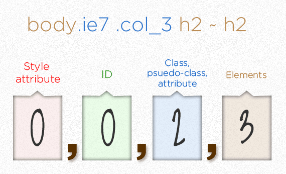
Up to this point, you've heard all about the 'cascade' in Cascading Style Sheets. That cascade refers to the way in which styles are applied in a cascading pattern of increasing specificity. Up to this point, you've heard the term "specificity" used colloquially, but here we're going to give you a quick way of putting a number value on a given selector's specificity.

As a quick rule of thumb, look at a selector, and put a number in the correct box that corresponds to the number of each selector's component parts. As an example:
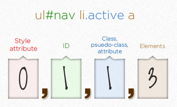
In this example, there are more component parts in the second example, but the first is still more specific (and would take precendent over the second in the event of a rule collision) because of the power of the ID #nav
While the <style> tag works for individual pages, it doesn't work well for scaling styles. Instead, it's better for each page to reference a single stylesheet, containing all of the CSS rules for the page. By keeping all of your CSS rules in an external document, you'll find that it's easier to make changes across a website, maintain separate roles on a dev team, and save yourself from early-onset carpal tunnel because of re-typing.
Let's create a stylesheet for our Portfolio Project that applies to all of our pages!
-
First, we need to create a separate file with the
.cssfile extension. Let's go ahead and call itstyle.css. To keep things organized, let's create that file inside its owncssdirectory (since we might want to add multiple stylesheets to the same document). HINT:$ mkdir css $ touch style.css
-
Next, we need to
linkthat stylesheet to each of our pages. In the<head>of each page, add the following:<!-- for your landing page --> <link type="text/css" rel="stylesheet" href="css/style.css"/> <!-- for all other pages --> <link type="text/css" rel="stylesheet" href="../css/style.css"/>
Do you know why we need different
hrefvalues for our landing page and our media, projects, and blog pages? -
At this point, there shouldn't be any difference in the way your pages look or behave, since there's nothing in
style.css. For now, you should stage, commit, push, and deploy your page to make sure that everything looks the same in the browser. -
Now we need to refactor all of the styles across pages. Copy all of the styles from each page into
style.csspage-by-page, starting with your blog page. Make sure you get each page looking like you'd like it. Remember that all CSS properties from here on out are shared between pages! If you need to make changes to your HTML to better organize your styles, that's OK, too. -
Once every page is looking good, stage, commit, push, and deploy your changes. And congrats on your pretty new Portfolio site!