Authors: Zachary Zhang, Eric Kim, Daniel Lee
- Research Questions
- Motivation
- Dataset
- Challenge Goals
- Method
- Work Plan
- Results
- Impact and Limiations
- Work Plan Evaluation
- Testing
- Resources Used
-
Question:
AveragePricevsTotalVolume. How do they compare, is there a correlation between the two, and what are the general trends? We would have 3 plots, 1 is to plot the trends in Seattle. The other two plots would be to see the overall trend in the US.Result: Generally there is a correlation between the average price of avocados and total volume except for organic avocados. Also the most popular bags sold in Seattle are small avocado bags.
-
Question: Do the prices of avocados reflect their yield? In other words, how would an avocado's price be affected by how many avocados were produced for a time period (in our case, a year)? Adding on to this, if there was some sort of correlation between the yield of avocados and their prices, could this be reflected for other fruits as well? For this question, we'd have two graphs: one graph would compare the yield of avocados versus their prices, and the second graph would compare this trend with another fruit's yield trend (in our case, apples).
Result: There was indeed a correlation between the price of an avocado and the yield of an avocado. From 2015 to 2017 we saw that both the price and yield of avocados were steadily increasing. However, from 2017 - 2018 we saw that while the price of an avocado was decreasing, the yield of avocados drastically slowed down, to where the trend was the slowest out of the years. We also saw a slight correlation between avocados and apples - from 2015 to 2017, we saw that both fruits had an upward trend and were both being produced at a sharp rate, but when 2017 arrived, the yield of avocados slowed down significantly, but even more interestingly was that the yield of apples actually started to plummet.
-
Question: Can millenials feasibly save enough money from an over-indulgent lifestyle of avocado toasts (homemade and retail) in order to finally purchase a house? It's said that the glib daily spending of millenials is why they can't afford to save for a house, but we plan to put that to the test.
Result: In even the most extreme case of avocado/avocado toast consumption, there is little hope for the average millenial to ever be able to purchase a home from just daily savings alone, as the cost of property far outpaces the amount that can be saved from frivolous purchases.
“When I was trying to buy my first home, I wasn’t buying smashed avocado for $19 and four coffees at $4 each,” -Tim Gurner, Australian millionaire and real-estate mogul
As we all know avocados are the bane of millennials, avocado toast is too tantalizing for millennials to resist which is why they have such poor fiscal responsibility and is the reason why the middle class is shrinking. Or is it? We propose to examine avocados and their devious nature in the hopes of determing the veracity of the previous statements.
The purpose of our analysis here is to first determine the general trends of avocados. We are curious about the general feel of how avocados are doing in the U.S. This is to help us establish an overall feel of our avocado dataset.
From there, we want to see whether avocados truly are the reason why millenials can never purchase a home of their own. Is it due to the lack of savings being put away that prevents millenials from home-ownership? Or is the ever-inflating housing bubble that locks the middle-class into rentals? We want to see if Mr. Gurner's statement holds any water or if it's all just boomer talk.
https://www.kaggle.com/datasets/valentinjoseph/avocado-sales-20152021-us-centric is an updated dataset that contains observed avocado sales data that the Hass Avocada Board collected from 2015 to 2021. It was created by Valentin Joseph to add additional observations up to 2021. The original dataset created by Justin Kiggins only went from 2015-2018.
The dataset contains 13 columns. Each row is a recorded observation.
| Column | Description |
|---|---|
| Date | The date the observation was recorded |
| AveragePrice | The average price of the sold avocados in the observation |
| TotalVolume | Total volume of sold avocados in the observation |
| plu4046 | The amount Small/Medium Hass Avocado (~3-5oz avocado) sold in the observation |
| plu4225 | The amount Large Hass Avocado (~8-10oz avocado) sold in the observation |
| plu4770 | The amount of Extra Large Hass Avocado (~10-15oz avocado) sold in the observation |
| TotalBags | Total number of avocados bags sold in the observation |
| SmallBags | Total number of small avocado bags sold in the observation |
| LargeBags | Total number of large avocado bags sold in the observation |
| XLargeBags | Total number of extra-large avocado bags sold in the observation |
| type | Type of avacado can either be organic or conventional |
| year | The year the observation was recorded |
| region | The geographic location where the observation was recorded. Geographic locations can be states, cities, US regions, and more |
http://data.un.org/Data.aspx?d=FAO&f=itemCode:572&c=2,4,5,6,7&s=countryName:asc,elementCode:asc,year:desc&v=4 is a dataset that shows the area harvested, the total yield and production emissions for avocados in every country, as well as total count for the entire world. It is provided by the Food and Agriculture Organization and provides data from 1961 to 2018.
The dataset contains 5 columns. Each row contains a specific statistic for the production and yield of all avocados.
| Column | Description |
|---|---|
| Country or Area | The place the observations were made |
| Element | The type of statistic recorded (This can be Area Harvested, Yield or Production) |
| Year | The year the statistic was recorded |
| Unit | The unit of the element recorded |
| Value | The total amount of element that was recorded |
http://data.un.org/Data.aspx?d=FAO&f=itemCode:515&c=2,4,5,6,7&s=countryName:asc,elementCode:asc,year:desc&v=14 is a dataset that shows the area harvested, the total yield and production emissions for apples in every country, as well as total count for the entire world. It is provided by the Food and Agriculture Organization and provides data from 1961 to 2018.
The dataset contains 5 columns. Each row contains a specific statistic for the production and yield of all apples.
| Column | Description |
|---|---|
| Country or Area | The place the observations were made |
| Element | The type of statistic recorded (This can be Area Harvested, Yield or Production) |
| Year | The year the statistic was recorded |
| Unit | The unit of the element recorded |
| Value | The total amount of element that was recorded |
https://files.zillowstatic.com/research/public_csvs/zhvi/Metro_zhvi_uc_sfrcondo_tier_0.33_0.67_sm_sa_month.csv is a dataset taken from the real estate site Zillow. The set compiles the monthly prices of houses in cities across the US since 2000. Prices are centered around the Zillow Home Value Index (ZHVI), which reflects the typical value of a home within the 35th-65th percentile range of home prices in an area.
The dataset contains 6* columns: (There are over 200 columns, but most are just dates)
| Column | Description |
|---|---|
| RegionID | A six-digit number used to identify the region, most likely for internal use |
| SizeRank | The rank of the area's population in comparison to the other regions |
| RegionName | The name of the area |
| RegionType | The type of area the listed region is, essentially all values are MSA (Metropolitan Statistical Areas) |
| StateName | Abbreviation of the state where the listed region is located |
| Date | The date when the price was recorded in MM/DD/YYYY format |
-
A challenge goal we want to do is use
plotlyfor our plotting needs and New Library as a new library to learn. It would be primarily for question #1. It would be interesting to see the trend of each city for avocado data on a map instead of using a line plot. If it is to difficult we can just use a stacked line chart fromSeaborn.In the original proposal for question 1, we wanted to graph avocado data with geometries. Unfortunately the
regioncolumn in the dataset was very inconsistent in its formatting. Some strings had no space others others had space for each word. The different regions included were very confusing. There were some cities, a couple of states and some general regions of the US. Due to these issues we elected to plot avocado data in Seattle and accross the entire US. -
Our second challenge goal we want to do is to try and combine multiple datasets together to try and form trends that answer our research questions. For example, for question 2 we want to use multiple datasets in order to try and recognize trends between avocado prices and yields, and we also want to compare our trends for avocado yields to other fruits to try and see if yield trends are universal or dependent on the fruit.
-
For question #1 we have to clean up the columns in the avocado dataaset due to inconsistencies in how the string data was formmated. We might have to do a join. We will also have to filter
regionto only cities. From there we will be able to create Choropleth plots. ForAveragePricevsTotalVolumethe two columns would be plotted onto one graph usingsubplots()frommatplotlib.pyplotas a stacked line plot. After loading in the geospatial data we can plot two seperate Choropleth plots. Ideally we would want to have a time component usingyearorDatebut initially it will be either one chosen year or an aggregate of all the observations. By plottingAveragePricevsTotalVolumeon one graph, we should hopefully be able to see trends and potential correlation between the two columns. For the Chorpleth plot we will be able to see how cities differ and maybe regional differences or similarities. -
For question #2, filtering all the data is incredibly important to create the right kind of trends that we want to make. For the avocado prices, we'd want to pick a location (in our case, it would be the Americas) and time range to take our data from, and then pick out the data that only pertains to our research question. For our second question, we'd only want the prices of avocados sold as well as the total volume and bags of avocados that were sold. From our bigger yield dataset, we'd only want the Americas as well as the
yieldwith our selected time range. We'd then construct two graphs, one that shows the price versus the yield, and then compare this trend with ourapplesdataset with another graph. This may change as we put it into practice, but this would be a general outline for what we'd want to do. -
For question #3, we will first explore the external housing dataset for the most and least affordable housing markets that are represented in our avocado dataset. From there, we will then aggregate the average price of an avocado for both locations in each given year in the avocado dataset. From there, we will determine an appropriate amount of avocados consumed each year, represented as
AnnualAvocadoExpenses. We will then multiply that amount byAveragePricein order to determine a total amount of expenses. We will then compare that to the average price of a house each year in the most and least affordable housing markets. Additionally, we will repeat the process for a second plot, but rather than using the average price of an avocado for the given year, we will instead find the average price for avocado toast in the most and least affordable housing markets.
For working together on this project we have a GitHub repository. We are all going to be using VSCode and there is an automatic flake8 linter that runs on every commit. If any of us runs into unexpected challenges, we have a group chat for communicating. We are going to be working on the questions in parallel in our Python files and working on the challenges when it makes sense to. We will split up the work based on the questions. Each question will be split into it's own file. Any code shared between the questions will be put into its own file and imported.
| Tasks | Time Estimate |
|---|---|
| Question 1 | 6-7 hours |
| Question 2 | 8-9 hours |
| Question 3 | 10-12 hours |
| Style and Testing | 25-30 hours (cumulative) |
| Writeup | 10-15 hours |
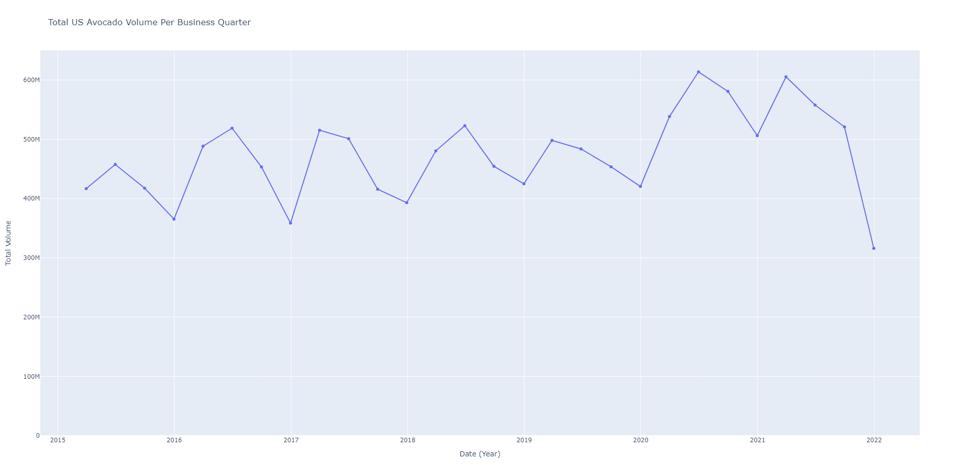
Looking at the graph of total volume of US avocado sales, we see an increase overtime. There are quarter to quarter fluctuations with peaks generally the spring and falls in the winter. This makes sense because like all fruits, they having a growing season. When supply and quality of avocados fall so will demand. There is a massive drop in the winter of 2021 where the total volume of avocados falls by 50% compared to the summer of 2021. This could be a result of COVID cases surging in the sametime frame.
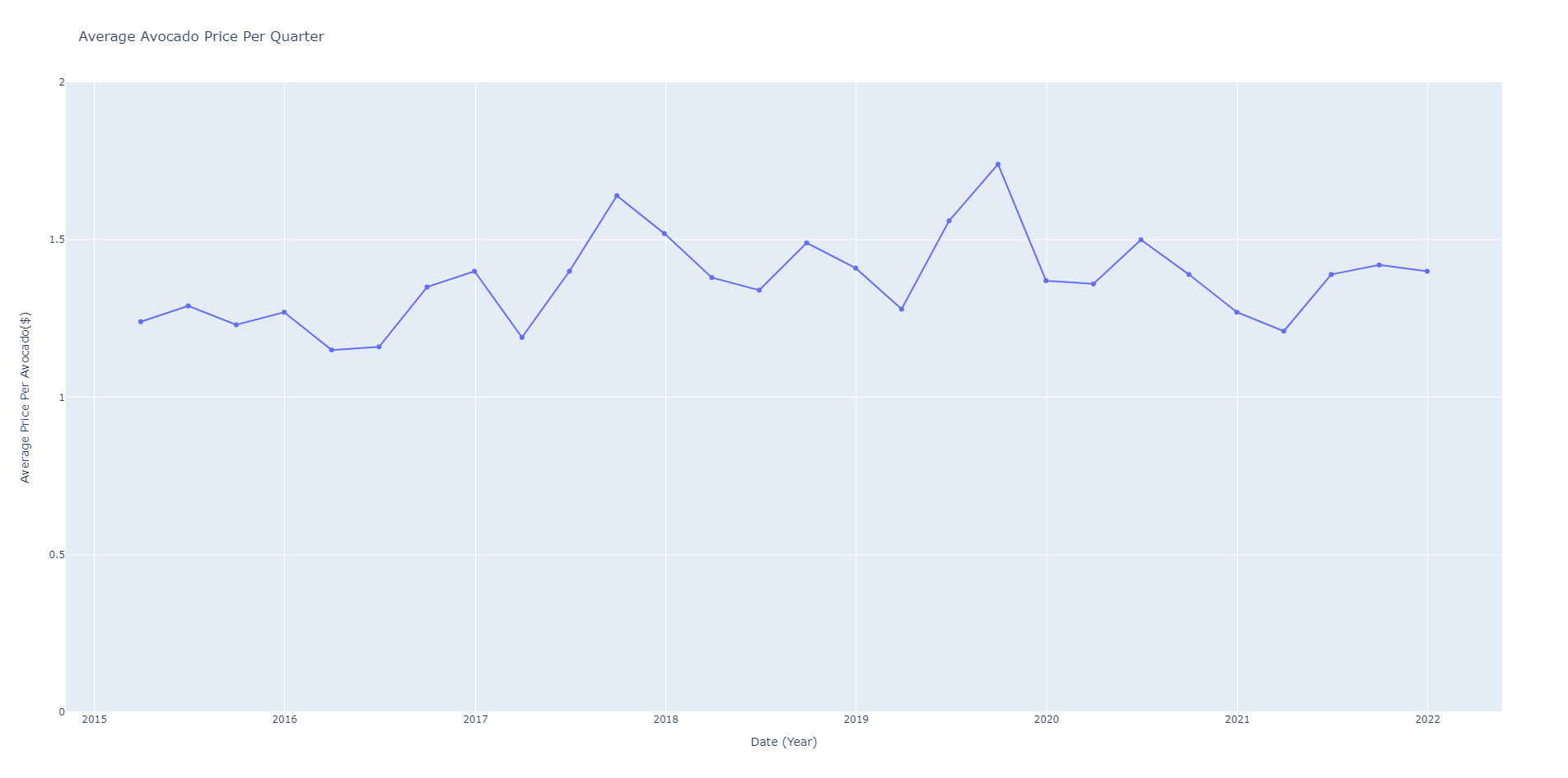
For the average price of avocados, the price is fairly consistent with a slight upwards trend. The quarter to quarter fluctuation could be caused by the cost with growing the avocados.
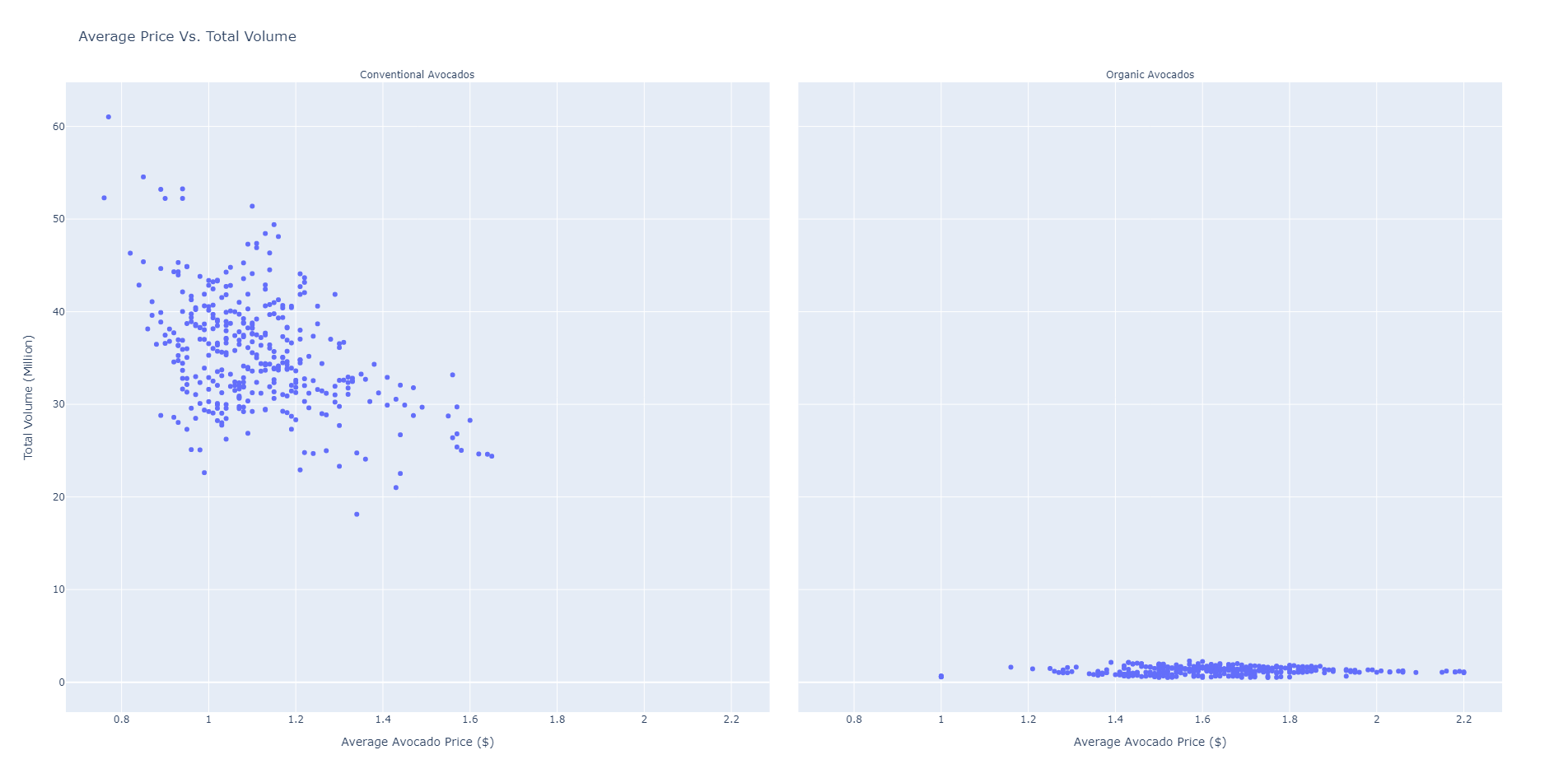
When comparing the average price of avocados and the total volume, two interesting trends occur. We see on the left graph that conventional avocados have a negative correlation between the price and volume. The economics of scale means that the more volume there is, the lower the price would be.
But on the right, when looking at organic avocados there is no correlation. The price of organic avocados is correlated with something else. A potential cause for this might be because the volume of avocado sales is low and an increase in the cost of growing organic avocados.
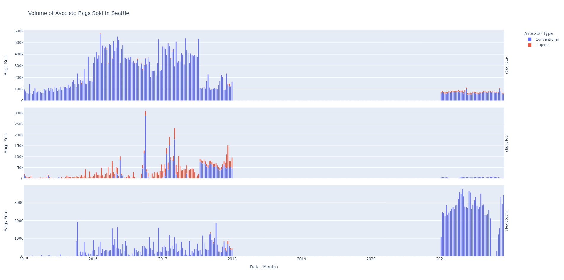
When we look at Seattle the number one thing is that there is a 3 year gap in the data which means we won't have a very good picture of whats going on. Graphing the volume of different avocado bags shows that small bags are by far the most popular in Seattle. What's interesting is that there is an increase in sales in the beginning of 2016 to the end of July of 2017. Also conventional avocados make up the vast majority of sales. With large bags, organic avocados were more popular. And Xlarge bags saw a giant increase in popularity in 2021.
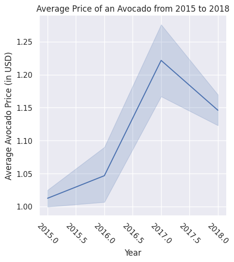
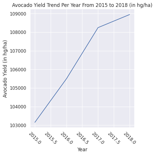
First, looking at these two graphs we can see that from 2015 to 2016, there was an increase in both avocado prices as well as avocado yields. It's hard to say whether or not the trend for the price line up exactly with how much was produced, but we can definitely see an increase for both of these factors. From 2016 to 2017, we can see that both the yield and price are increasing still, but the price increase is much more drastic this time around. This is interesting because the yield from 2016 to 2017 is only marginally more than the yield from 2015 to 2016, which could indicate other external factors affecting the price jump of the avocado. However, the most interesting trend here is from 2017 to 2018. We can see that the yield from 2017 to 2018 drastically decreases, from around 2500 avocados in hg/ha in 2015 - 2017 to around 1000 avocados in hg/ha in 2017 - 2018. Not only that, but when we look at the average price of an avocado from 2017 to 2018, it drops from around $1.22 to $1.15. This is a clear indication that something occured in 2017 to where the production of avocados decreased, which then decreased the price of the avocado. This is, of course not very clear, but we do know that there certainly is a correlation between the price of an avocado and the yield it has.
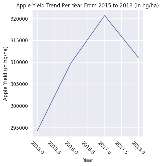
Now we look at the same graph of a yearly yield of an avocado, but compare it to another fruit. We picked the apple for our case. Looking at these graphs, we can see some very clear similarities, but also some very stark differences. When we look at the 2015 - 2016 trend, we can see that both trends are that of a sharp incline - although more apples are being produced in general, we only need to analyze the trends of their yield. From 2016 to 2017, we see again that the trends are very steep and inclining. Although the yield of apples slowed down, they are very much still being produced heavily. The yield of avocados are also still strong. But, when we get to 2017 - 2018, we again see some very interesting trends. While avocado production has slowed down starting from 2017, we can see that apple production and yield has actually halted, and instead is decreasing drastically. Again, we cannot derive what factors could have caused this just from our graphs alone, so we definitely know that something occured in 2017 that severly damaged the yield of fruits. However, from our previous correlation we can also infer that as apple yield was dropping, the price of apples were likely plummeting as well. If the production of avocados resulted in a 7 cent average price drop, we can definitely assume that the declining production of apples also caused a significant decrease in price.
Generally, the results reflected what we generally expected. With the average cost of a single avocado hovering around a dollar to a dollar and a half, the daily purchase of an avocado provides little in terms of savings. Especially when compared to the housing market, which has ballooned over the past 7 years, we can say with confidence that avocados alone aren't holding back millenials from purchasing a home.
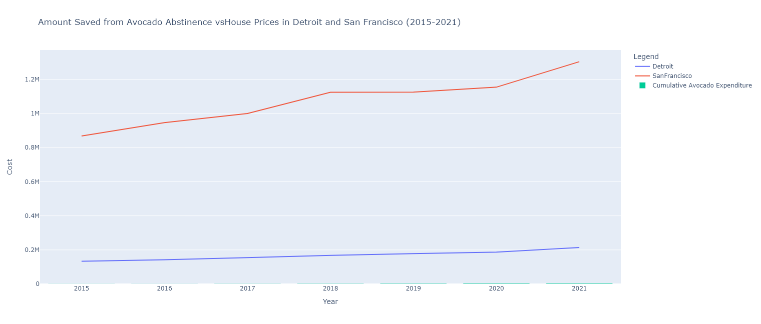
That isn't to say we weren't entirely surprised by this statistic. For example, we expected at least some regions to stagnate in housing prices. Detroit, despite the urban flight from the region, still commanded a 37.9% increase in home price. This outpaced the time period's cumulative price increase from inflation of 14.33%. Other things that we observed was the large jumps in house prices from 2020 to 2021, which followed the nationwide boom in the housing market during the pandemic.
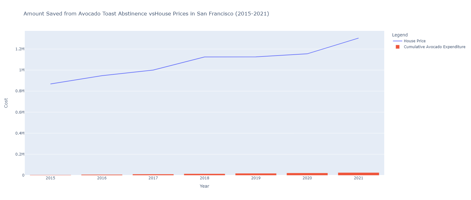
What inspired the change from including both Detroit and San Francisco to just San Francisco came down to two main reasons. Firstly, there was no resources online to give a general estimate of the price of avocado toast in Detroit. While a current menu could have been examined, that would be based on current prices rather than the prices during the time period examined. Secondly, it generally fit the findings in outside research. Particularly, in a Time Magazine article, it was stated that San Francisco had the highest avocado toast consumption per capita. This somewhat justified the unlikely situation that someone would get avocado toast for breakfast everyday.
This is the portion that gives Gurner's statement some creedence. More significant purchases like an avocado toast everyday or a morning coffee do end up adding up. In our case, a person could have saved almost $26,000 over the 7 year period from 2015 to 2021. However, at the same time, the premise of this situation is extremely unlikely, even if San Francisco is America's capital of avocado toast. This plot assumes that a subject is buying a 10 dollar avocado toast every single day for breakfast. Outside of an unlikely circumstance, seeing how the price of a house in San Francisco increased over 50% over the same period, it is clear that the reality is that millenials have little chance ever escaping the trap of renting. A 2019 TD Ameritrade survey found that 37% of millenials say that they are behind on retirement investment because of housing costs. So the upward trend in property values in metropolitan areas bodes an unsustainable trend in our housing economy.
There are some major limitations of our results. For question #1 we saw that there is a correlation on between volume and average price for avocados but we did not establish that it is a causal relationship. We also didn't account for any extenuating factors. Our data only uses data gathered by the Hass Avocado Board which only collected data on hass avocados. This analysis wouldn't apply to other avocado types.
For Question 2, there were many factors that caused limitations. The biggest limitation for this question was that the avocado sales dataset only covered the United States, while the avocado yield dataset covered the entire Americas. For our project, this was good enough, as the US is one of the strongest economical countries of the Americas, however this could have diluted or misrepresented our trends on our graphs. There was also the issue of the timespan. Question 2 looked at 3 years, from 2015 to 2018, and although this is a sizeable time frame to look at, having more years to analyze would have solidifed our trends and would have gotten more accurate results and analysis. We also didn't know any other information regarding the yield and sales dataset, including where they were produced or where they were sold, for example. This also reflects back to the analysis, as we're not sure what caused the decline of production between 2017 and 2018 because there is no indication from the data that would tell us this.
For question #3, we obviously couldn't do what we planned out exactly due to the lack of a resource on Detroit's average price for avocado toast. However, the largest limitation we felt we ran into was that of time. Originally, we planned to us an ML model to predict avocado prices based on the incomes of various age groups in the US. However, that didn't pan out as we anticipated since we felt that somewhat strayed from challenge goals and general narrative we wanted to follow in the data. As a result, we had to quickly come up with a new question, write code for it and evaluate the results. So, we felt that we didn't explore the dataset as much as we wanted to explore larger trends in the US.
We felt that our work plan more or less worked. Being able to work asynchronously on each task with occasional check-ins worked well for our team. We didn't exactly follow the planned work pacing, especially with Task 3 since we had to eventually go back and start from scratch. Furthermore, the timing of Style, Testing, and the Writeup were also a bit off, given the interconnected nature of the three, but not to a point of complete overestimation, which we felt was good. We felt that we worked more or less on pace despite differing schedules and are satisfied with the work that we did complete.
More or less for testing, since we were relying on plots and examining trends from them, we often manual went through the dataframes during the cleaning/formatting process in order to confirm whether the data was still correct after joins. As a result, much of the testing isn't present as it was done during the coding process.