dat-ecosystem website_growth_program_page #100
Comments
tasks
worklogfeedbackproposals |
|
feedback The font seems a bit bold but the small one a bit hard to read, though i like the pixelated style and overall it's pretty good. I have to admit that the current page almost puts the content in a random order and what you did is definitely a huge improvement, but I think we can improve it further. For older concepts please check: In our opinion, the ideal basic order would be to have an intro header (e.g. you have it), So each phase needs a name (we can call them just numbers for now, where each named phase along the road would then have:
regarding (1.): it's mentioned in the last section in above screenshot. By structuring the entire growth program into a long journey with several quests, there wont be any sections anymore, because descriptions and details are all added next to the specific phase they belong to, that was the idea from the beginning, but neither the github issue link above nor the current website captured that perfectly well yet sadly. I hope we can do it now :-)
The CTAs in the end don't look really like CTA buttons, only the green color gives it away, but they should anyway be next to the stage/phase they belong to. |


tasks
worklogfeedbackproposals |
|
feedback growth programlooks cute :-) While I like the idea, one major concern I kinda have is that I feel the "roadmap". Next - the entire thing is supposed to give an "overview" over how users can progress. check links: All of those are again just inspiration and you can explore more. Of course, menubar or a collapsible terminal on the bottom might always be present regardless of which |
tasks
worklogfeedbackproposals |
|
feedback The ideas we had so far before my latest feedback might be useful in the detailed zoomed in view, but we definintely need to overview map view and i would start with it and once we have it come back to the zoomed in detailed view and adapt it based on how the overview looks. I guess you have checked the links in my previous feedback :-) |
tasks
worklogfeedbackproposals |
|
feedback +1 perfect If a filter overlay can make the whole thing more dithered and high contrast, it might improve the retro feel even more. it feels a tiny bit too good and smooth, but it's minor, really - it's already amazing :-) If everything you did stays as it is, but the "style" can change slightly towards, e.g.: It might give it an even more retro appearance :-) Here are 3 videos where it is a bit "zoomed in", but if you would "zoom out" to see not just one screen at a time, but all screens at the same time, you would probably get to something like the 3rd video.
other feedback
Again, please check the links above, they are important :-)
So if you can incorporate that a bit more grid/pixel/square like retro feel would be good. Don't forget, you can "ZOOM OUT" a lot to fit more map on the screen, we will need to have |

tasks
|
|
feedback first - misunderstanding, the color is not what i was referring to.
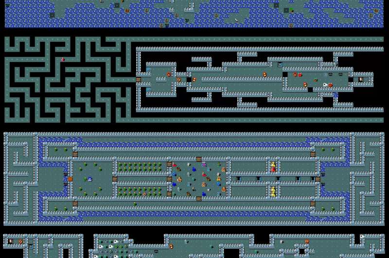
Also, as you can see in those old gameboy style images, a specific larger object can span multiple grid fields, basically you draw a little forrest or building or lake and cut it into square pieces and then that represents the thing that spans multiple grids. ...there are lots of options and in the end we just need to somehow make it look and feel as retro as possible :-) Like if you forget color scheme, just see how every sprite sits in one of the squares, where each square is aprox. the size of the main avatar I see you already adopted the map a little bit in that direction. The monochrome color is not the thing i was going after, which is why one of the links shows a lot of color too, as you can see in the "nethack" link above. MAPThe main point of the maps below is not the color and not the style. We can use more our colors (not necessarily just monochrome) and we can use different variety of garden styles inspired stuff... google image search about botanic gardens, chinese gardens, japanese gardens, english gardens, french gardens, etc... whatever you can find to basically place some sort of sprite simplified maybe pixelated or whatever version of interesting garden objects or elements or plants into our garden, to make the map more interesting. ...maybe it includes a lake, maybe a jungle, maybe a field, maybe an area with edible plants .... maybe with hills and mountains and desert, probalby not, it should be garden themed, but wild garden, jugnle like would still work i guess. It shouldnt be repetitive and boring basically :-) Maybe one place can also be clearly the "starting place" ...where one enters the garden for the first time. garden entrance Additionally, our chat on discord had quite a few zelda/supermario maps with zoomed in and zoomed out state, because the current map is somewhere in the middle, see here: please compare with zoomable here: https://mikesrpgcenter.com/zelda3/maps.htmland another example of a whole map:parts of map: (zoomed in)
Lastly, the garden has not yet enough variety, so maybe we can take inspiration from those game screenshots or you can find some more ...or you check french gardens, english gardens, all kinds of gardens or botanic gardens and create some more variety in the garden landscape :-) So in terms of colors, your approach is great In terms of effect, photoshop or others. Regarding pixel to svg. What i otherwise found:
FOr SVG:
integrate into website
Maybe a special kind of marker is needed to indicate where a user can click on the app to get some interaction or at least info options. The "japanese gates" are those or maybe the colored things inside the japanese gates, but if we extend the map, we might need more of those spots, not just japanese gates :-) But i like it :P By the way, for mouse hover to highlight is cool, but also clicking to keep it selected and show the information. When you hover a different POI (point of interest) you might see that in the menu below, but when you stop hovering the different POI, it will show again the content from the currently/formerly selected POI. If you click somewhere else, it probably unselects and shows no content in the menu below.
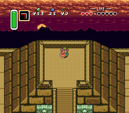
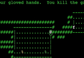
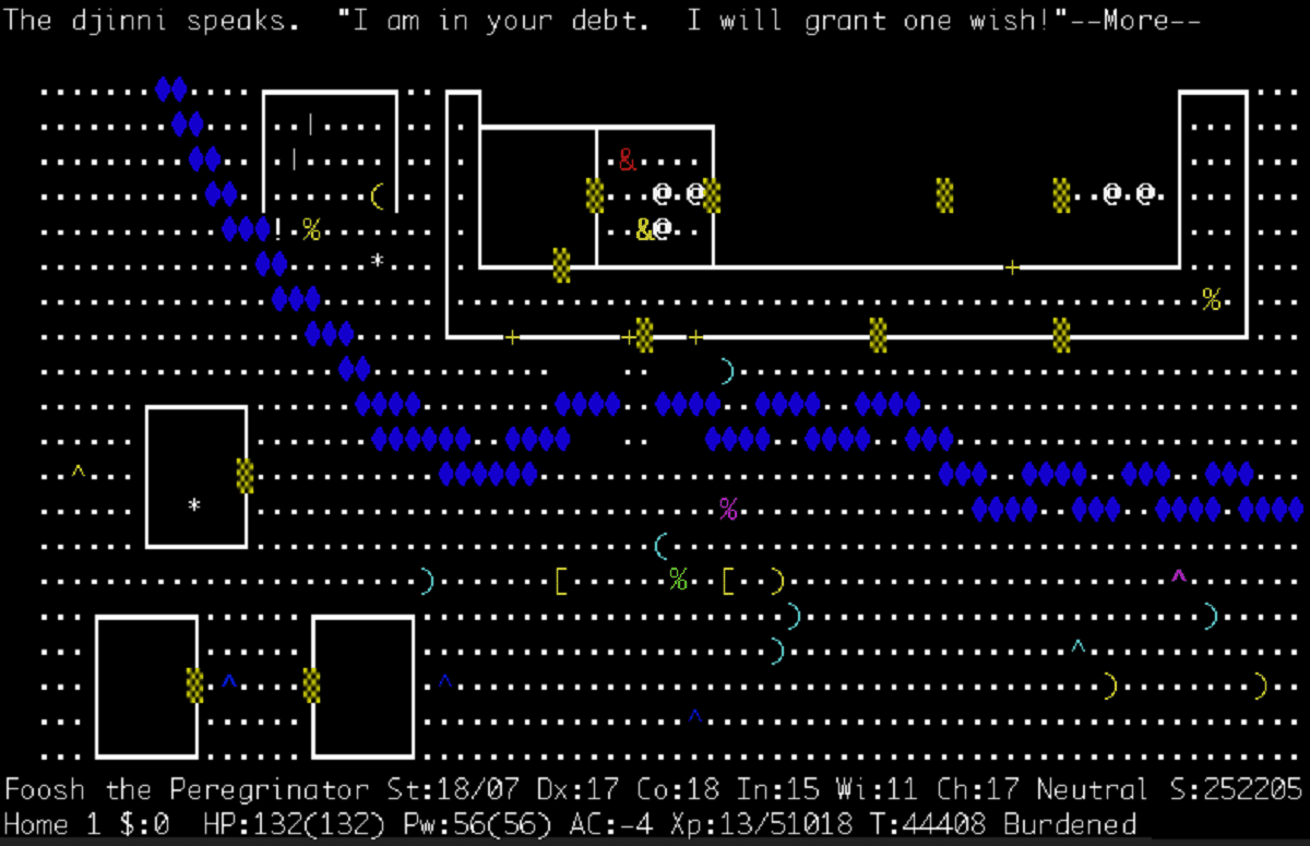
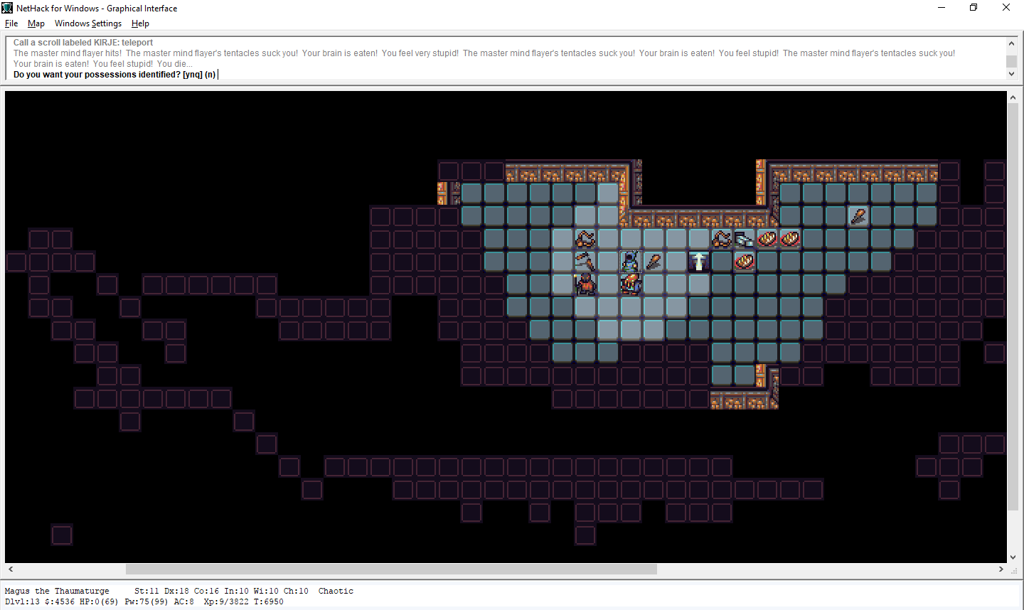
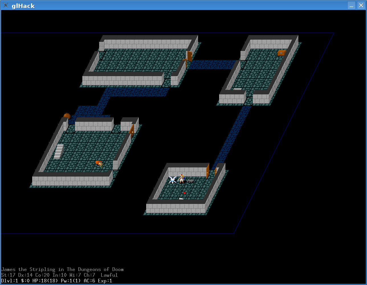
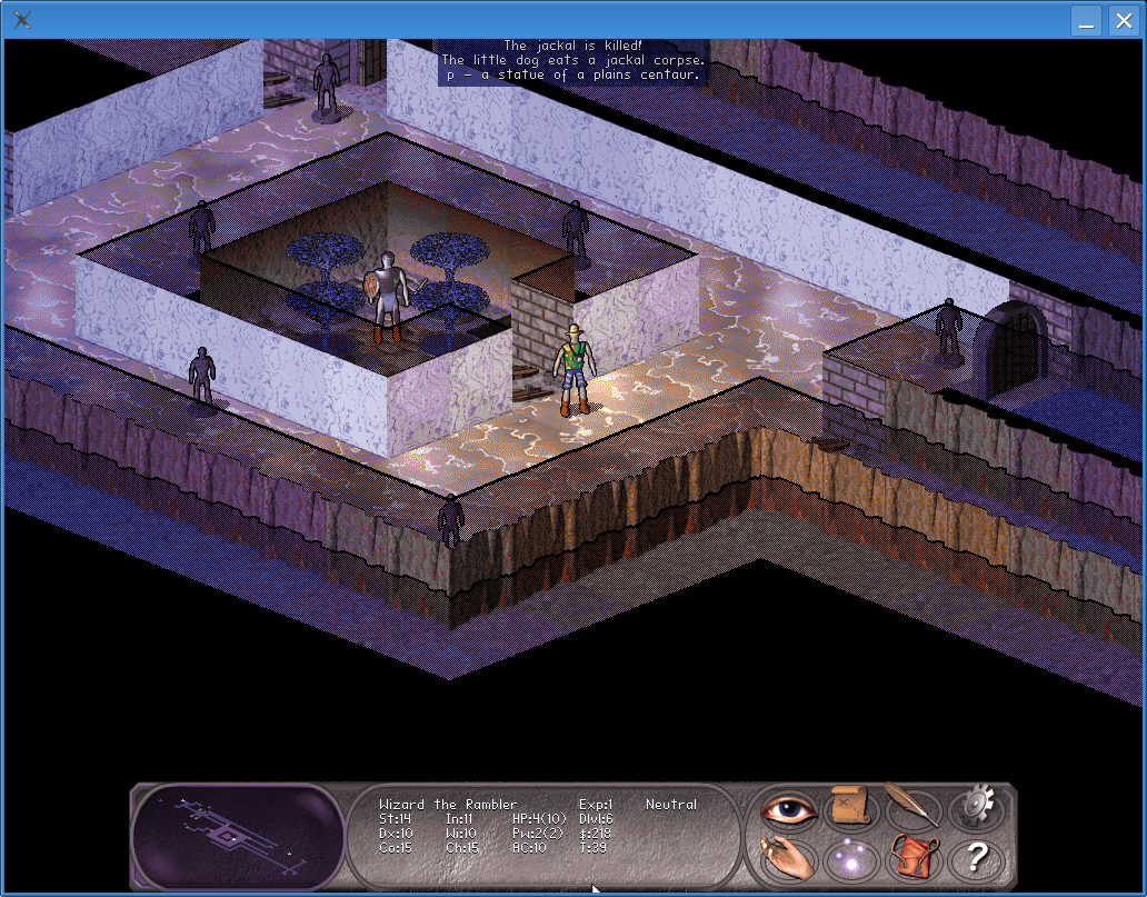
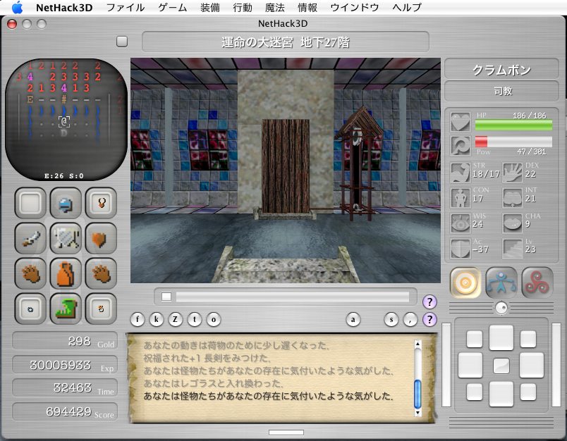
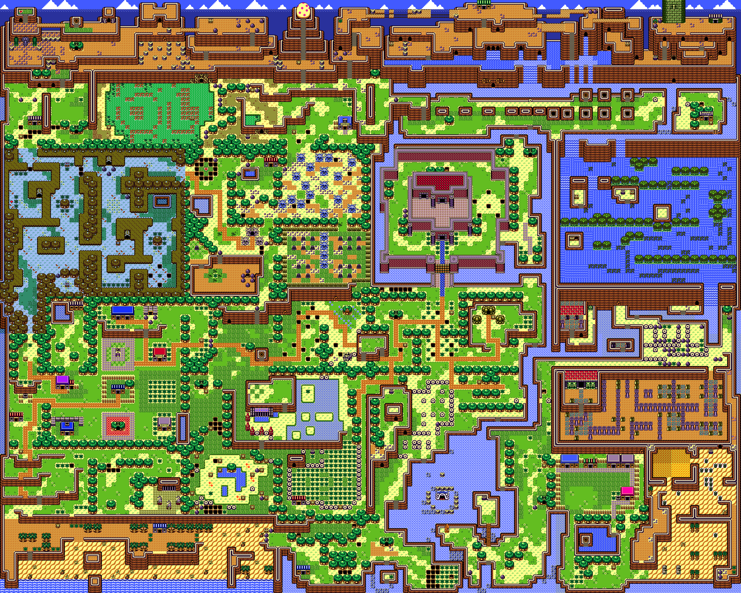
Maybe once you are logged in and have a profile, it could also show your own profile information, but we will see :-) zelda mapThe pyramid by the way is in the cener of the map where the palace is, but it is not in the map that shows the palace, which is the "light map" or "overworld", but instead it is in the "dark map" the "underworld" map of the same thing, but actually in the game this is future map and past map (hence the name "link to the past"). The main feature is the amount of zoom that is possible in zelda. And yes, ... and things could or probably should be EVEN SMALLER than shown below :-) nethack (inspiration)imagine we design the maps like in nethack, e.g. const P = 'Big Tree'
const b = 'small bush'
const o = 'character'
const H = 'japanese gate'
const _ = 'grass'
const garden_level_1 = [
P, P, P, _, _, _,
b, b, o, b, b, o,
P, P, P, _, _, _,
b, b, o, H, b, o,
P, P, P, _, _, _,
b, b, o, b, b, o,
]so we can decide which characters to use, for water, and bridges and so on... We probably also can design different areas of the garden in this style separately and then connect them in a second step. also, we need flags or some way of including/placing project logos into the garden at different spots Basically from the same primitive grid defined in an array, you can generate different quality levels, like in the game
|


tasks
|
|
feedback we can definitely start implementing the page. We will just make a placeholder or something using the twitter banner as a placeholder, OtherwiseOnce we actually design the growth program garden page, please lets relax and take a lot of time so we can work out the details and plan the entire page well - so no rush. Most importantly people can see that a lot of love went into the growth program page. checkout this pinterest board for inspiration for different parts/scenes of the garden/nature style map: https://www.pinterest.co.uk/serapath/wizard-game/ Also yes, let's choose a color palette and see how many colors we need to make things look great. gras, wood, sand/beach, water/sky Your current approach is good and the different assets you made work well.
Literally explore those maps and copy the best and most intersting parts. Maybe we can also come up with certain styles and parts of the map as a seperate area - like a "game level" and then later combine those into an overall map of different areas connected through bridges or sea or small passages ... a garden of gardens. Here is a high rest map: https://i.imgur.com/fBOIJb9.png Maybe you can of course also try to take some inspiration from modern games that are in some ways pixel retro, but not really. They also have environment with greenery or certain game elements, like a menu or minimap that we can use to display certain "mission statements" or allow a person to use the minimap to scroll quickly through the map without zooming out first, e.g. https://www.youtube.com/watch?v=FQxm6_Y7stg From what we have: hmm, ... also, maybe it is better to show the japanese part of the garden by default (basically to decide and zoom in on one part of the garden as a starting point, but be able to have buttons to zoom in/out, to go up to the overview and wrapping the entire "growth program map" in a program window. we need generally some more more iterations when we start again on doing the growth program part i think. currently the gray roofs look a bit ...gray 😆 Currently it still looks like one or two villages conncted through a forrest, relatively boring and monotonous. Now you asked also about the style. trees places a bit randomly vs. trees placed in a block or sequence. They are both good. We want variety in different areas. When you zoom into any place in the garden, each place should somehow have it's purpose, which is why we can try to copy/steal from good inspiration and make a convenient "continent" or complex of areas, some island, but not necessarily, maybe bridges, or maybe other ways. It is a fantasy land, so you can make a rainbow bridge or whatever else mystical or magical ideas could make sense - again maybe stealing ideas from popular games, modern and retrofying it or even better directly from great retro games with a lot of plot and storyline and thought. After all, companies like Lukas Arts or Blizzard started out small. Blizzard made:
Lucas Arts now Lucas Films made
These days they make AAA games worth gazillions with high end graphics and they make exceptional movies, but also back then they had massive teams of professionals to pour a lot of effort and thought into games, similar to nintendo, so these are hard to compare with modern games made by indie developers in terms of how much thought went into details, because of the big budgets that went to make those seemingly simple games from todays perspective. It should look much more like a jungles of interestingly interwoven gardens, with all kind of garden styles and special places and the path doesn't always have to be a straight path, maybe stepping stones, maybe changing materials, maybe just empty fields, maybe more curved, maybe thinner or thicker... and while we stick to this retro grid style, he sprites/tiles can be interesting to get little repetition and make every part special - probably by "stealing" the best ideas from cool game maps of nature and gardens and copying ideas and combining them. Basically: find lots of amazing examples and pick and steal the best partsSo some links i shared above, to copy literally from.
Now in order to make things more garden or jungle or maybe let's say it "national park style" with the most stunning and beautiful nature and all kinds of trees, flowers, caves, creeks, streams, flowers, birds, etc... just adapt the idea for maps and combine it with inspiration from all kinds of botanic garden pictures (check google) and combine it with garden maps here is more inspiration to pick from: and this and https://www.milbysmaps.com/2020/07/26/the-great-garden/ Milby's Maps or https://www.reddit.com/r/DnD/comments/zlp0c0/a_garden_map_with_a_small_hut_30x30_and_a/ or r/DnD - A garden map with a small hut [30x30] (and a possible encou... here is an even better search query also, the idea of little garden islands connected by bridges was pretty cool in your previous one 🙂 ..maybe the types of bridges could be different for different garden parts |
#37
todo@input📦 buttons_v0.0.1 dat-ecosystem website_buttons #71@input📦 original_banner_v0.0.2 from dat-ecosystem website_original_banner #84@input📦 info_card_1_v.0.0.1 from dat-ecosystem website_info_card_1 #90@input📦 info_card_2_v.0.0.1 from dat-ecosystem website_info_card_2 #91@input📦 title_paper_tag_2_v.0.0.1 from dat-ecosystem website_title_paper_tag_2 #93@input📦 bullet_point_paper_tag_v.0.0.1 from dat-ecosystem website_bullet_point_paper_tag #94@input📦step_card_1_v.0.0.1 from dat-ecosystem website_step_card_1 #96@input📦 footer_v0.0.3 from dat-ecosystem website_footer #75@input📦 terminal_frame_v0.0.2 from dat-ecosystem website_terminal_frame #86Apply Now@output📦growth_program_page_web_v0.0.2fromcomment@input📦growth_program_page_web_v0.0.2@output📦growth_program_page_web_v0.0.3fromcomment@input📦growth_program_page_web_v0.0.3rocksigngrassmale character@output📦growth_program_page_web_v0.0.4fromcomment@input📦growth_program_page_web_v0.0.4@output📦growth_program_page_web_v0.0.5fromcomment@input📦growth_program_page_web_v0.0.5@output📦growth_program_page_web_v0.0.6fromcomment@input📦growth_program_page_web_v0.0.6@output📦growth_program_page_web_v0.0.7fromcommentThe text was updated successfully, but these errors were encountered: