在今年6月,CSS 工作组再次更新已经处在 CR 状态的 CSS Text Decoration Level 3 标准,同时 Level 4 的 ED 版本也于近期更新。大家很熟悉的 CSS2 用法 text-decoration ,到了 CSS3 就拥有很多新的特性。本文将介绍 Level 4 中最新添加的特性。
text-decoration-line也就是 CSS3 之前的 text-decoration,属性有如下的属性值:
| 属性值 | 效果 |
|---|---|
| none | 无效果 |
| underline | 下划线 |
| overline | 上划线 |
| line-through | 删除线 |
| blink | 文字闪烁 |
| spelling-error | 展示为浏览器拼写错误的样式 |
| grammar-error | 展示为浏览器语法错误的样式 |
特别提醒:
blink属性将会被废弃,推荐开发者改用 CSS Animation 中的效果进行实现。使用
spelling-error或者grammar-error,浏览器可能会丢弃自定义的color,stroke,fill等属性的设置。
该属性主要针对的是 underline, overline, line-through 这三个修饰线样式,设置这些修饰线的粗细,除了直接使用数值表达外,还可以设置为以下的属性:
| 属性值 | 效果 |
|---|---|
| auto | 由浏览器决定粗细 |
| from-font | 如果首个可用字体中含有推荐粗细数值,将会使用,否则行为与 auto 一致 |
该属性主要控制下划修饰线基于其起始位置的偏移量。而下划线效果的起始位置又由text-underline-position控制,那么我们线简单复习一下这个属性。
| 属性值 | 效果 |
|---|---|
| auto | 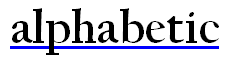 |
| under | 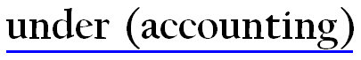 |
| left |  |
| right | 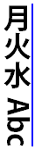 |
auto将下划线置于基线位置,而under则置于元素的文字内容之下,left 和 right 则用于竖排排版的文字模式中。
回到text-underline-offset中,下划线的位置首先基于text-underline-position设定的初始位置,然后再加上text-underline-offset设定的数值,除了数值设定外,还支持以下的属性值:
| 属性值 | 效果 |
|---|---|
| auto | 由浏览器决定合适的偏移量 |
| from-font | 如果首个可用字体中含有推荐的偏移数值,将会使用,否则行为与 auto 一致 |
在对文字使用下划线效果时,我们可能经常会发现,下划线会划过字符本身,导致阅读体验不佳,那么text-decoration-skip的出现将会去解决这一类问题。正如属性名的字面意思:该属性用于设定修饰线的省略位置。
该属性用于控制修饰线效果在文本中的什么位置要被跳过,它支持如下的属性值:
| 属性值 | 效果 |
|---|---|
| none | 什么也不跳过 |
| objects | 跳过拥有 display:inline-block效果的元素 |
| spaces | 跳过所有空格 |
| edges | 跳过元素边界; 举个例子: <u>奇舞</u><u>周刊</u>,“奇舞” 和 “周刊” 由两个元素进行呈现那么修饰线效果将在这两个元素的边界断开,由于元素之间的紧密相连的,为了保证效果,浏览器会相应地缩短修饰线的长度保证断开效果。 |
| box-decoration | 跳过盒子的外边距,内边距以及边框区域 |
| leading-spaces | 跳过文字开头的空格、分字符以及letter-spacing和word-spacing效果 |
| trailing-spaces | 和leading-spaces效果相同,只不过做用于文字结尾 |
那么,对于中文汉字来说,原则上是没有基线概念的,当中文与英文同时出现的时候,可能会受到英文字符基线的影响,修饰线效果仍然覆盖掉中文字符,为了解决这个问题,标准中还制定了这个属性很好地解决了此类问题。
该属性只有两个属性值,一个是 auto 一个是 none。当使用 auto 时,修饰线效果必须跳过所有字形绘制的区域。
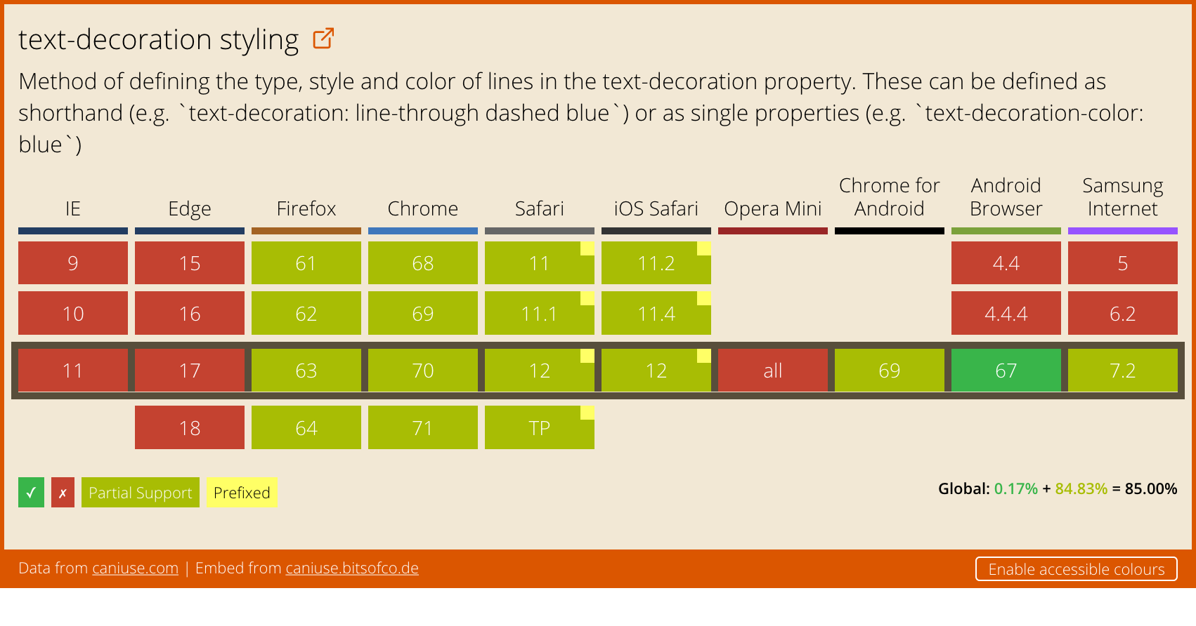
这些文字修饰功能目前各大浏览器还没有很好地支持,但是它能给阅读体验上带来的收益的非常显著的,让我们拭目以待吧。